Nature Defines Our Palette

A starfish from the Island of Nusa Lembongan in Bali.
Travel. Nature. Inspiration. These three words are so closely tied together for me as a designer. I find that traveling is the best way to ignite my inner creative. This summer, our ambitious travel plans were halted. Instead, I’ve gone back through my archives of photos from past trips. I’ve started to look at these these forgotten photos with a new light.
Nature guides us. There is so much beauty in the natural world. My conceptual influences are always drawn from materials found in nature, whether it be a photograph from past trips or a walk through Prospect Park. Since we work with many natural materials, we look to nature to inform many of our color schemes. When we start a project, this is the first thing we do during the conceptual phase of our Design Process. A concept and palette lays the groundwork for every choice we make when selecting finishes, furniture, lighting, and any other project components. To curate a balanced color palette, we combine the following three attributes from nature.
3 ELEMENTS OF A STUDIO ALYSE PALETTE
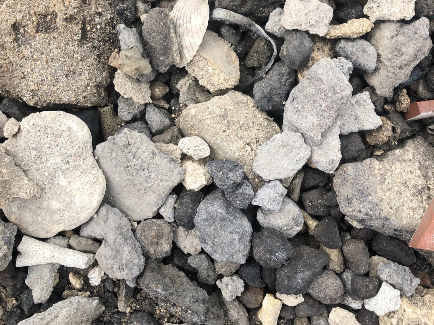
Rocks found at the base of a river at Elephant Nature Park in Chiang Mai, Thailand
NEUTRALS
Materials with shades of white, grey, ivory, taupe, tan and even black lack an intensity or saturation, and create the foundation for our palette selection. We look to earthy materials such as stone, clay, cotton, straw, and even dirt to build this base. These various hues and tones create a layered effect, which keeps the space from feeling stale and cold. We don’t shy away from monochromatic palettes, but we know the elements of texture and variation are key to making a successfully designed neutral palette. I find that taking photos of the earth tends to produce the perfect combination of neutral elements. You’ll constantly find me taking pictures of the ground when travelling somewhere new..note photo to the left!

Elephants. This old lady, was sweet, slow, and leathery. Her color and texture alone were breathtaking, not to mention her grand size and wise disposition. Chiang Mai, Thailand.
TEXTURE
Our color schemes aren’t just about color, texture is also a key element of a well-balanced palette. Texture creates a mood for every space. Shiny textures reflect lights and create cooler impressions. We love to look for softer textures because they create a sense of warmth by absorbing light. Texture often dictates the tone and weight of an interior. We strive to have a balanced mix of natural textures and color. Whether it be the skin of a kind old elephant, or the wool of an alpaca, animals are often a key element of textural inspiration.

Flower found on a walk in the mountains of rural Thailand in small-town Mae Chaem.
ACCENT COLOR
Accent colors make a palette complete. We look for 2 or 3 accents to pull into a color palette to add depth and warmth. Color ignites creativity and stimulates the mind, while neutrals can be slightly more passive. I often look for more muted, but still rich colors, such as the flowers to the left. Flowers and agriculture in general are a great inspiration for the color we use in our palettes. Sunflowers, beets, raspberries, and pumpkins are just a few of my go to favorites!
NEXT STEPS
The Mood Board below shows our color palette for a residential project we’re currently working on in North Carolina. For this palette, we looked at a mixture of rocks similar to the one shown above. The idea was to find colors and textures that were naturally occuring. The finished result? A palette full or rich tones and varying neutrals.

Our Rector Abode Project is based on this color palette. I can’t wait to share the install photos with you!
A FINAL NOTE
Once our palette is established, we start to pull samples and materials specific to our project. We look for local artisans and vintage pieces that will tie everything together. Textiles are a great way for us to bring the natural elements into our finish selections. Linen, Wool, Cotton, Silk, and Eucalyptus are all examples - you can learn more here. Harder surfaces like stone, wood, and ceramics are natural materials we also integrate into our projects. As this process is refined and edited, we begin to pull in furniture, lighting, and accessories that follow the concept and color palette. We are not only able to bring in nature through the materials we use, but also with the colors we select.
Happy Saturday! Stay safe and healthy!
xx
-A